Once you have collected data on the weight room floor, the next step is to analyze it! Gain insight into how your programming is impacting athletic performance, and make changes accordingly. Dive into it with the Perch TRAIN Overview!
There are multiple ways to look at your Perch data after you have completed a lift, the newest of which is the Perch TRAIN Overview page.
In contrast to the Export page on the Perch Web App and looking at the sets individually on the Perch Tablet App, the Perch TRAIN Overview page will allow you to see data visuals to show trends and patterns based on your generated data.
To get to the TRAIN Overview page, navigate to the Perch Web App and select the Insights tab along the top menu and click View under "Train Overview", or navigate directly to the page via the URL.

Filters
The filters will control what you do (or do not) see on the screen. You can filter for Time, as well as Team and Position based on the associated team, and Exercise.

Trend Indicators
Your trend indicators will give you an idea of where your team/position is in comparison to where they were for the same period of time before the selected filter. For example, if you have "Last 30 Days" selected, the values displayed in white will show you the metrics of your most recent 30 days, and the trends will be based on the 30 days prior to that. If you have "Last 7 Days" selected, the most recent 7 days will be compared to the 7 days prior to that.
**If you select a custom date range, the trends will not display - only the data in white for the custom date range selected.
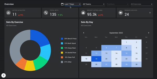
The Manage Devices tile is clickable, and will take you directly into your Manage Devices page, where you can see device status, upgrade your camera system software if needed, and transfer your presets from one camera to another. This tile will show you when there's an update available for the camera tracking software by displaying a blue dot - if you see this, please select and navigate to the Manage Devices page.

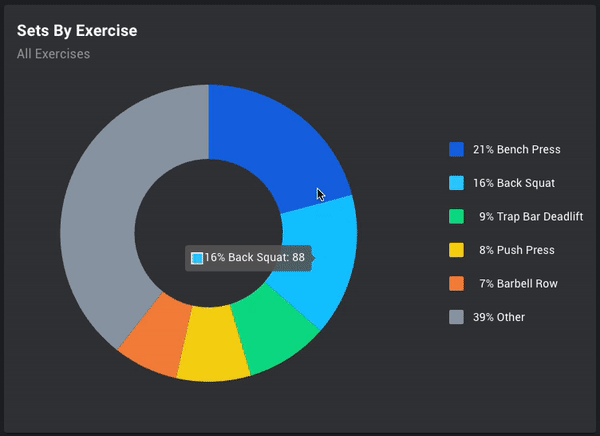
Set Count by Exercise
The donut chart and calendar widget are there to show you your volume breakdown in two different ways: one by exercise, and the other by day.
On the Sets by Exercise widget, you can see a volume of sets recorded per exercise by hovering over the section of the chart, as well as a relative percentage of your exercise breakdown.
Set Count by Day
The set count by day will show you what your volume looks like on a day-to-day basis. The color of each day/tile is a heat map based on volume of sets. The darker the shade of blue, the higher the amount of sets performed on that day.
As you hover over a day, it will show you how many sets were performed on that day. If you click on a day, the filter on the top of the page will select that day individually.
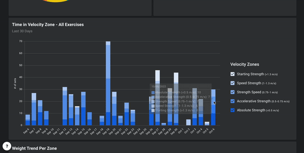
Time in Velocity Zone
This widget will display a count of total sets (based on set average) in the given time frame based on the filter, grouped by the main five mean velocity zones designated by VBT research. This will allow you to see how much volume is being collected in each zone, and understand how well your athletes are adhering to the speed zones designated to them throughout the course of a given cycle.
By default, you will see All Exercises displayed on the chart. To show individual exercises, use the filter in the top right hand corner of the widget. As you select exercises, the messaging on the widget title will adjust to either reflect that all exercises are selected, or how many exercises are selected.
As you hover over each individual column, it will tell you how many reps fall into each velocity zone. To remove some of the zones from your view in the widget, click on the name of the zone in the legend along the right hand side. To bring the removed zone back, click on the checkbox or the name of the zone in the legend.
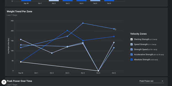
Weight Trend per Zone
Based on the mean velocity zones in the VBT research, this widget will show you a line per velocity zone and what the trend of that zone is based on date on the X axis, and weight on the Y axis. This can help you to see how you trend in various zones in relation to the load on the bar, and thus identifying if you are getting stronger over time within the same speed zones.
By default, you will see All Exercises displayed on the chart. To show individual exercises, use the filter in the top right hand corner of the widget.
Each individual data point on the graph represents an average of the load on the bar for the selected Team/Position selected in the filters at the top of the page. As you hover over the point, it will display that load. To remove some of the zones from your view in the widget, click on the name of the zone in the legend along the right hand side. To bring the removed zone back, click on the checkbox or the name of the zone in the legend.
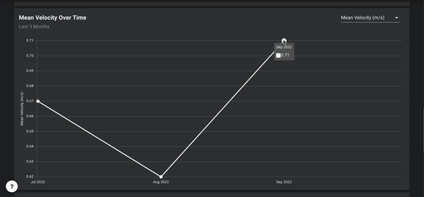
Metrics Over Time
Seeing your patterns over time can be a valuable tool to see how various metrics are trending, and whether or not those trends are aligning with the goals of the program you have set out to achieve over a given period of time. In this widget you can examine any of the 9 metrics Perch offers and see how they move over a given time frame.
By default, Mean Velocity will be selected on the chart, but you can change the metric to any metric that you are interested in seeing through the filter in the top right hand corner of the widget. The label of the chart in the top left hand corner is dynamic and will change to display what metric you have selected.
As you hover over each data point in the chart, you will see the average of the metric for the team/position selected on that day.
Set History
Similar to the current Insights page, the Set History has two tabs:
The Sets tab is a table widget of some of the information you would like to see with regards to your athletes. You can adjust how many rows you would like to see at once in the bottom right hand corner, with options of 25, 50, and 100.
The Users tab aggregates the data for each user into one line and displays the associated data for the given time frame - total number of sets, total tonnage, total work, and goal accuracy, which represents how often the users are hitting the Goals selected for them. Keep in mind that to be considered accurate, it must be inside the zone - anything above or below will be considered inaccurate.
You will also be able to adjust sets after you've left the weight room floor from anywhere with WiFi access! Select the Options icon on the right hand side of the screen to bring up the set data, and adjust information including exercise, athlete, and weight lifted. You can also mark ghost reps or annotate errors within the set.
.gif?width=600&height=295&name=ezgif.com-video-to-gif%20(6).gif)
If you have any issues seeing data or any questions regarding the Insights generally, please reach out to your Perch account rep or our support team by emailing support@perch.fit.