Through the Perch web app, you have the ability to broadly analyze data trends at a team and positional level through the Insights page. To get more granular and focus more on individuals, dive into the Athlete Profile!
When diving into data after lifting, the best way to look at things on a broad level is through the Perch Insights page where you can look at trends and data on the team and positional level. However, if you want to key in on one specific athlete to see how he or she is performing over time, you'll be able to see that information on the athlete profile!
To get to an athlete's profile, navigate to the User Management page of the Perch web app and select the athlete's name from your roster.
At the top of the screen, you'll see the athlete's first and last name, height and weight (if entered on the User Management page), and any associated teams and positions.
The first thing you'll see after the athlete's general information is two tabs for your selection, one titled Overview and the other Exercise. Whichever is currently being viewed will have a blue highlight underneath it.
Overview Tab
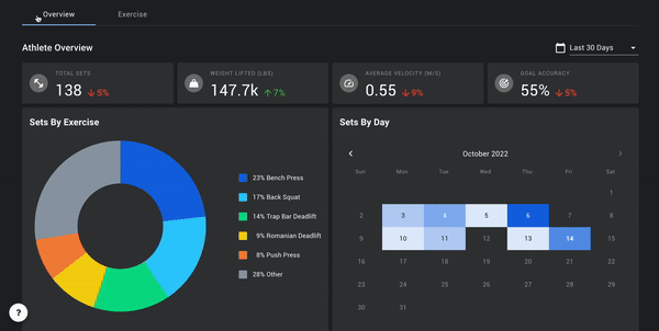
The Overview tab is more broad and similar to the Insights page, but is isolated to the selected athlete. At the top of the tab, you'll see trend indicators that give you an idea of where the athlete is in comparison to where he or she was for the same period of time before the selected filter. For example, if you have "Last 30 Days" selected, the values displayed in white will show you the metrics of your most recent 30 days, and the trends will be based on the 30 days prior to that. If you have "Last 7 Days" selected, the most recent 7 days will be compared to the 7 days prior to that.
**If you select a custom date range, the trends will not display - only the data in white for the custom date range selected.
Similarly to the Insights page, underneath the trend indicators you'll find a breakdown of volume by exercise as well as by date on the calendar. The color of each day/tile is a heat map based on volume of sets. The darker the shade of blue, the higher the amount of sets performed on that day.
Lastly, the Set History will display the data in a table format for the athlete over the given time frame. You can see the date range applied in the top corner of the widget that will reflect the overall filter at the top of the page.
Exercise Tab
Benchmarks
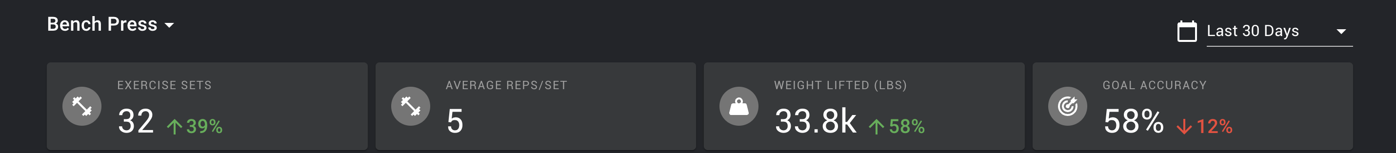
At the top of the exercise tab, you'll select the exercise and date range that you're interested in viewing in the filters at the top of the page. The trend indicators at the top of this tab will apply to these filters specifically.
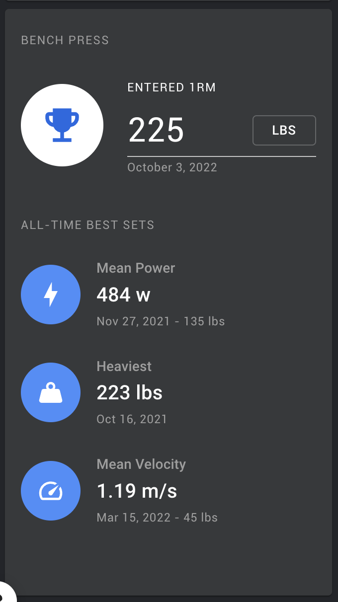
On the left hand side of the screen, you'll be able to see benchmarks of the athlete's all time bests for velocity, load, and power. Whether you're looking at peak or mean velocity or power will depend on your exercise selection - just as you see in the tablet app, any strength based movement will default to mean, whereas any ballistic/explosive movement will default to peak.
You can also enter an athlete's 1RM into the top of this widget - this will be the 1RM for the given exercise that will be reflected in the tablet app when selecting a relative weight off of the 1RM. Make sure that the weight unit is representative of your program - you can switch this by clicking the button where it says LBS or KG.
Trends by Load Range
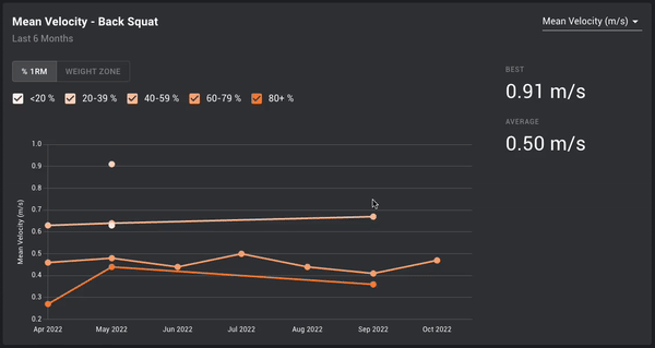
In this widget, you'll be able to see how any of the available Perch metrics are trending based on a load range. The metric selected in the top right corner of the widget will remain constant so that you can see how the athlete is trending within the selected range. For example, is the bar moving faster within a range of 60-79% of the athlete's 1RM over the course of the last 30 days?
The range can be toggled to either display an absolute load based on the weight unit or a relative load based on a percentage of a 1RM. To toggle between the two, click on the button at the top of the widget. You will see your change represented by the numbers in the legend either displaying absolute numbers or percentages. Each range can be selected on or off by checking the box next to the range.
Load Progression Analysis
At its most basic level, one way of knowing whether or not your athlete is getting stronger/improving in the weight room is to understand how an individual load is moving over the course of time. With the Load Progression chart, you can select a single load and understand if it's moving better, worse, or the same as time goes on. Simply choose your exercise and your date range, and you can see how the metrics are moving and changing as time goes one!

Load Velocity Profile
A staple of VBT! The Load Velocity (LV) profile will allow you to see where the athlete is proficient and where work needs to be done - is the athlete Velocity Deficient, Force Deficient, or Well Balanced? This widget will allow you to see what the slope of the athlete's LV profile is and compare it to other time frames to understand if heavier weights are moving faster than they were before. It will also generate an estimated one rep max for the athlete based on what the research tells us a general Minimum Velocity Threshold (MVT) is. Read more about this in our blog post!
The default line of the widget and the associated dot points will be based on the filters selected for exercise and date range at the top of the page. To show a comparison, select a date range from the drop down menu on the right hand side of the widget - the accompanying blue line will reflect the comparison's time range. For a visual representation of where the MVT is, select the MVT box, and deselect it to remove the line.
As coaches, you also have context on your athletes that we lack. For this reason, you have the ability to move the MVT up or down based on how you know the athlete to be able to lift - down for athletes who have the ability to grind out slow reps, and up for athletes who may be more explosive that won't be able to handle heavier loads at very slow speeds. As this is adjusted, the estimated 1RM will change.

Power Curve
When looking at your Olympic/Ballistic movements, the Load Velocity Profile will automatically change to a power curve. This will reflect how the athlete's power output is changing as the load changes. It will increase to a point, and then at a certain point as the power continues to increase, the load will get so heavy that the speed slows enough to decrease the power output. This chart will show you where that point occurs, and what the estimated load will be to maximize the athlete's power output.

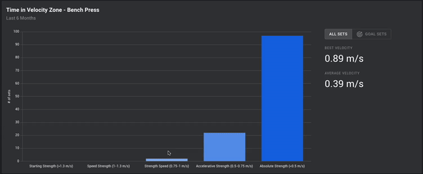
Time in Velocity Zones
Similarly to the widget on the Insights page, the Time in Velocity Zones widget will tell you which zones an athlete spent the most time in, and allow you to better understand if the prescribed programming was adhered to or not. To see a representation of every set within the date range for the exercise selected, select the All Sets button. If you'd like to see only sets where there were Goals applied, select the Goal Sets tab.
In the Goals tab, you will see two columns - one for Actual and one for Target. The Actual number is a representation of how many sets actually fell within that zone, and the Target number will tell you how many sets had that zone prescribed. In other words, if the Target column has a different number of sets in it than the Actual column, then some of your athletes spent time outside of the zone you prescribed for them. This is based on Set Average.
**The numbers in the Actual and Target columns only account for pre-set zone goals. Manual goals currently are not included in the columns, but will be included in the Goal Accuracy percentage on the right-hand side of the widget.